Zoya Caviar
CLIENT Personal Project
SERVICES Logo Design • Packaging
Zoya Caviar is a (fictitious) caviar brand focusing on bringing the public a high-quality product while also sourcing from sustainable fisheries (as beluga sturgeon fish are considered critically endangered) and giving back to their local economy in the process.
Challenge
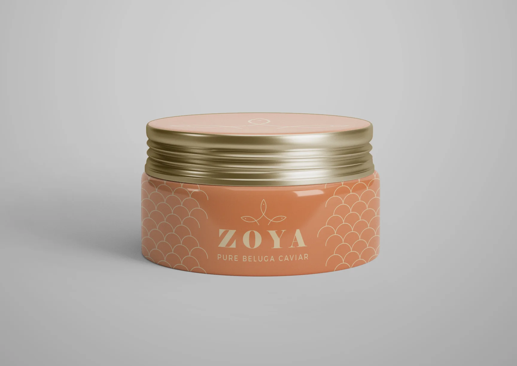
As caviar is a luxury product, the packaging should be luxurious in its own right, and the logo should also exemplify that vibe.
Develop a color scheme that nods back to the product’s origins.
Solution
For the design of Zoya caviar, I shifted away from my signature style of large, bold graphic shapes and instead went with thin, sleek line art to emphasize the product's delicate and refined nature. The logo’s icon is a crown of fish, a nod to both the product’s origin and its high quality.
Beluga caviar is black rather than the orange-gold of salmon caviar, but I felt that black and gold were overplayed in the caviar industry. I went with warmer tones that still felt luxurious and expensive, and would also look striking against the black caviar.